What the Most Successful Beauty Brands Have in Common
If you spend time studying fast-growing beauty brands — the ones that go from launch to sold-out in months, or from indie startup to retail placement in a couple of years — a pattern emerges. It’s not that they have better formulas than everyone else. In most cases, the formulas are good but not uniquely so. Similar ingredients are available to dozens of competing brands.
What separates them is almost always how they present themselves. And the most visible, most consistent part of that presentation is packaging.
The Brands That Break Through Look Like They Were Designed
There’s a quality that successful beauty brands share that’s hard to name but easy to recognize. Their products look considered. The bottle shape, the color, the finish, the label — everything feels like it was chosen intentionally and designed to work together. Nothing looks like it was borrowed from a catalog or added as an afterthought.
This quality isn’t about spending the most money. Some of the best-packaged indie brands operate on tight budgets. It’s about treating packaging as a design problem with a specific brief — who is this for, what does it need to say, where will it be seen — and solving it deliberately.
Brands that don’t break through often have the opposite quality. Their packaging looks assembled. The bottle shape is standard, the label is trying to compensate with busy graphics, the finish doesn’t suit the product category. The overall impression is of a brand that figured out the product and then found something to put it in.
Packaging Creates the First Impression That Sticks
In the beauty industry, customers encounter products visually before they experience them physically. A social media post, a review photo, a shelf display — these are the moments where most purchase decisions begin. And in all of these contexts, packaging is doing the talking.
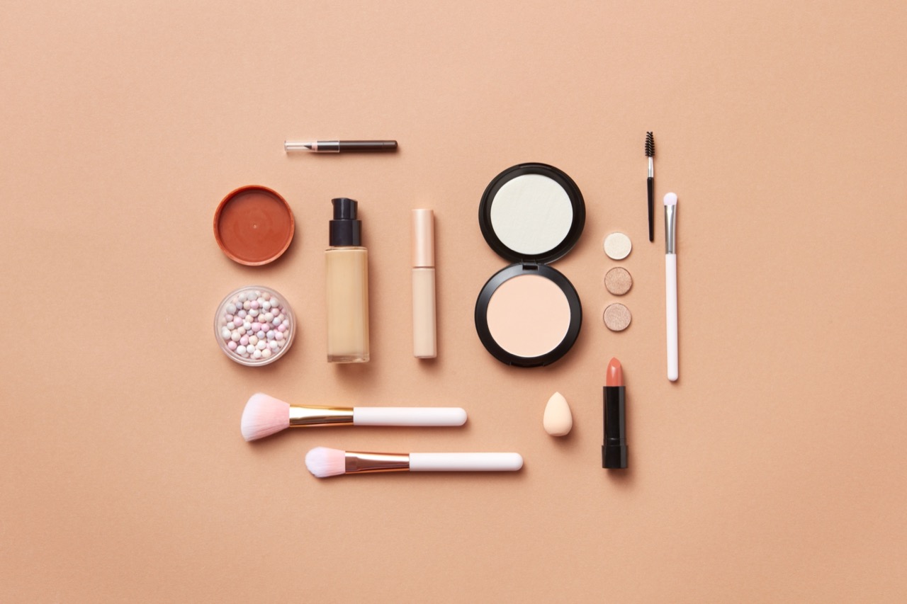
The brands that grow fastest tend to have packaging that does this job exceptionally well. Their products are immediately recognizable in a feed of hundreds of images. They photograph well in flat lays and close-ups. They look consistent across an entire product line, so that a customer who owns one product immediately recognizes a second.
This isn’t luck. It’s the result of beauty packaging design that was built for how products are actually discovered and shared today — which is mostly through screens, mostly in small formats, and mostly in competition with dozens of similar products.
Consistency Across the Line Signals Professionalism
One thing that separates established-feeling brands from ones that feel like they’re still figuring it out is consistency. When every product in a line shares the same visual language — the same proportions, the same finish family, the same closure style — the brand looks like it was built by someone who had a clear vision from the beginning.
This kind of consistency is only possible with intentional packaging design. When you’re pulling from stock options, you’re limited to what’s available, and “available” doesn’t guarantee “consistent.” A jar from one supplier and a bottle from another will almost always have subtle differences in weight, finish, or proportion that break the visual coherence of the line.
The brands that project professionalism and build customer trust quickly are almost always the ones that made coherence a design priority — usually by working with a packaging partner who could develop the full range together rather than sourcing pieces separately.
The Sustainability Signal Is Now Part of the Design
Another thing successful brands are navigating well is the sustainability conversation. Customers are increasingly attentive to what packaging is made of, whether it’s refillable, and whether the brand has made any visible effort to reduce waste.
The brands handling this well aren’t just switching to recycled materials and hoping people notice. They’re making the sustainability choice visible through the design itself — the natural material finish, the minimalist label that uses less ink, the refill system that’s built into the product concept from the start.
When sustainability is baked into the beauty packaging design rather than added as a sticker or a footnote, it reads as genuine rather than performative. And customers — particularly younger ones — are good at telling the difference.
What This Means for Brands That Are Earlier in the Journey
Not every brand launches with perfect packaging. Many successful brands redesigned one or more times before landing on something that really worked. The difference between the ones that recovered and the ones that stalled is usually whether they treated the redesign as a serious creative and strategic investment or just swapped one set of stock options for another.
The brands worth studying are the ones that used a packaging redesign as an opportunity to ask harder questions — about who the customer is, what the brand stands for, and how the packaging can do more work for the brand than it currently does. The answers to those questions, translated into design, are what produced the packaging that made the brand recognizable.
The Formula Is Table Stakes
It’s worth saying directly: in most beauty categories, a good formula is necessary but not sufficient. Customers expect products to work. When they don’t, no amount of beautiful packaging saves the brand. But when the formula is solid, packaging is often the variable that determines whether the brand gets discovered, gets remembered, and gets bought again.
The most successful beauty brands treat these two things — what’s in the bottle and what the bottle looks like — as equally important, and design them to reinforce each other. The packaging communicates what the formula delivers. The formula delivers what the packaging promises.
When those two things are aligned, a brand has something that’s hard to compete with.